BRANDING

Clinic Bétera Dental

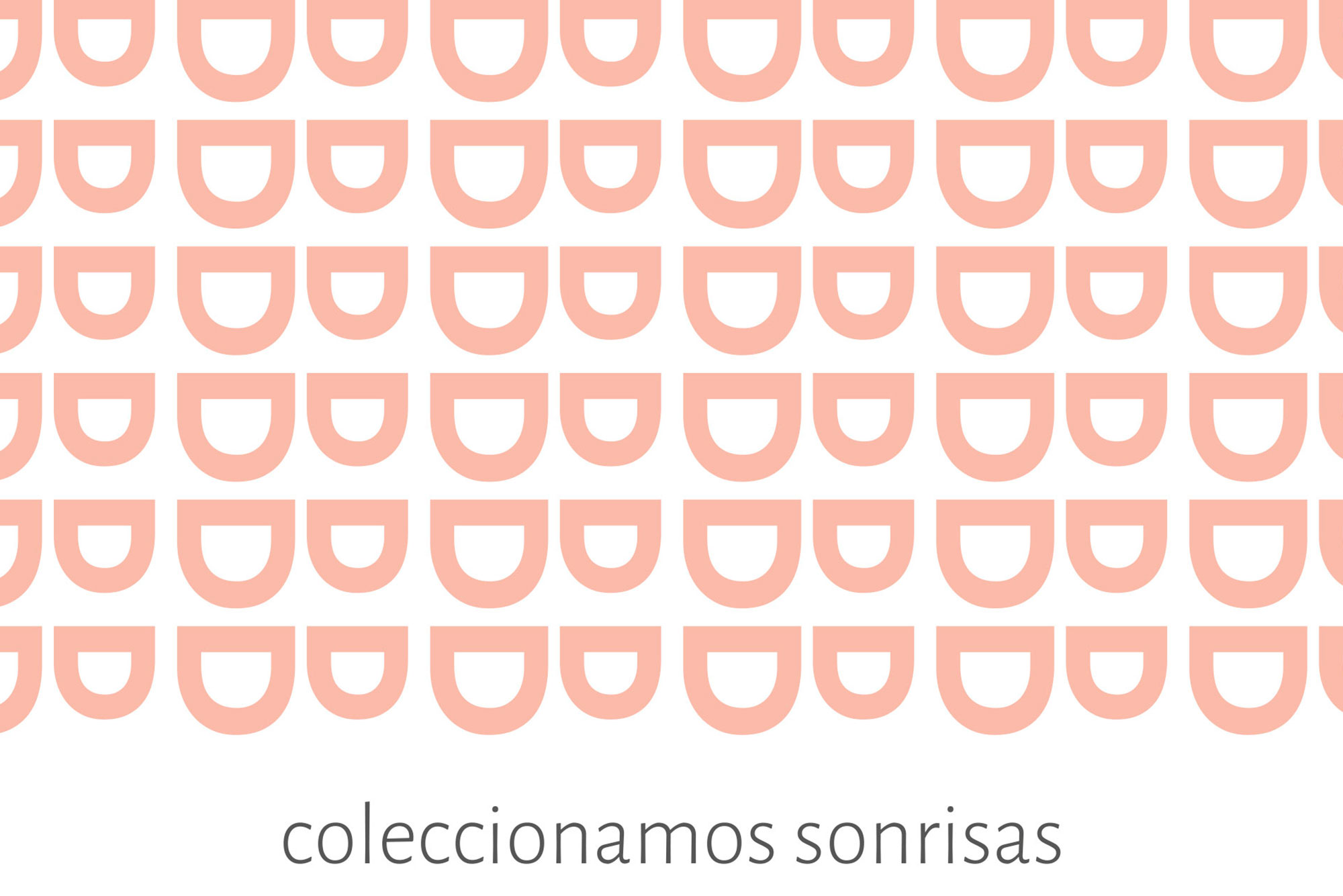
For the general branding of Bétera Dental, we start from the classic concept of the Smile. This is used to build a B (Bétera) generated by two Ds (Dental). The smile (the rotated D) is used as a fifth element to generate a texture or mapping that serves as a support for communications and adaptations. Condensing the concepts: Smile, Bétera and Dental, is the success of this brand construction.

The colours, soft pink and grey, define the brand with the elegance and serenity of a dental clinic. The cleanliness of the fittings is an identifying feature and its branding extends to the interior design.

The brand voice (the voice that expresses the brand) is very fresh and young. It is accompanied by modern, casual and brave images that contrast with the purity and cleanliness that the brand breathes.

SUBIR