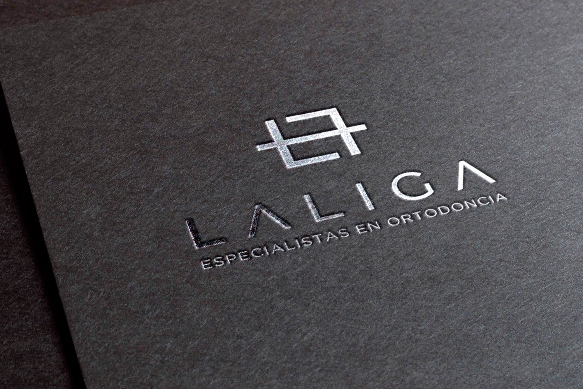
The brand had to exude confidence, balance, symmetry and visual cleanliness, which is why we worked on an isotype based on the simplification of a bracket, a characteristic element of the service they offer. We have developed a simple, differentiating and structurally memorable isotype, which is in line with the naming. We worked on our own typography to give the brand personality.


