BRANDING

Unavida Cosmetics

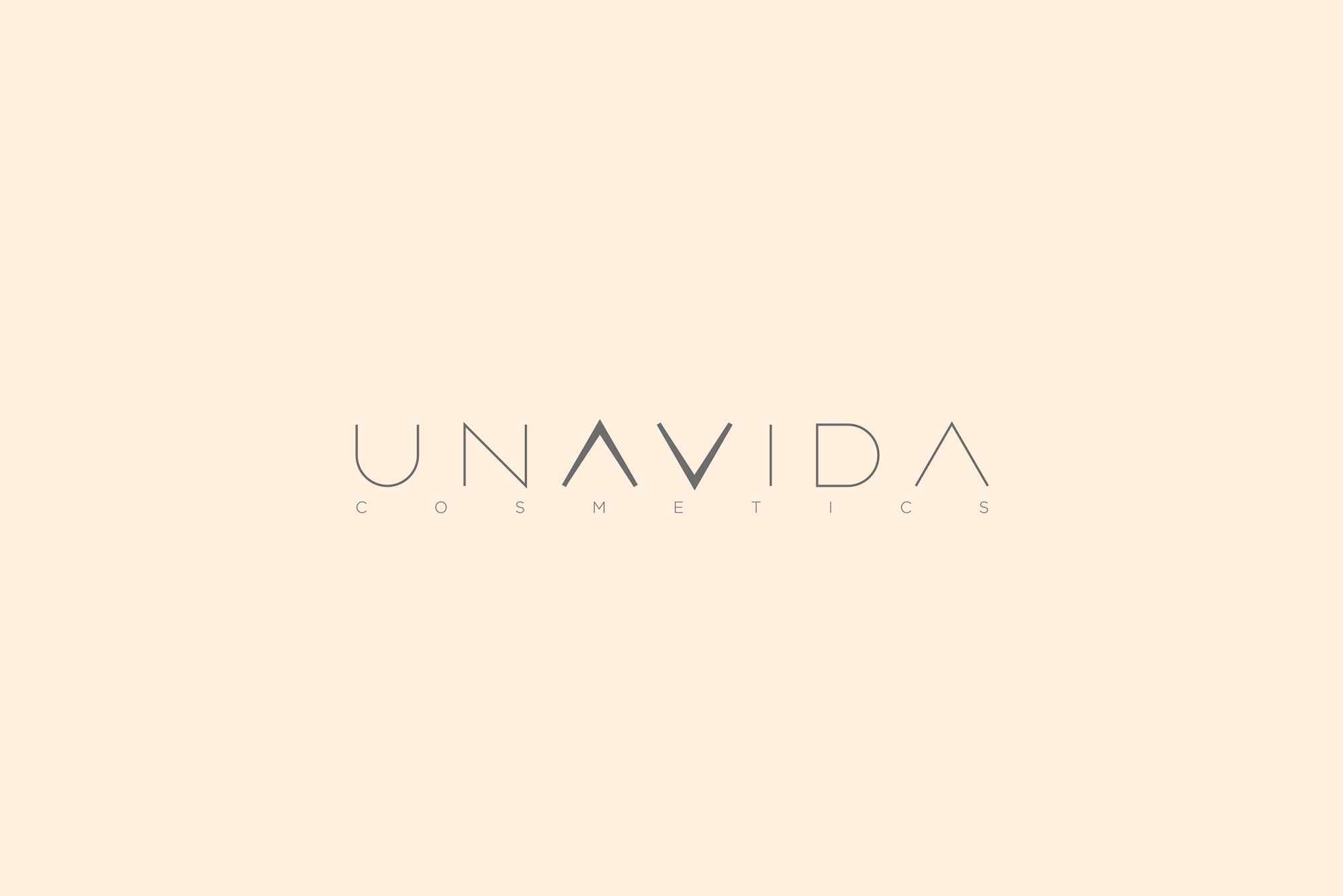
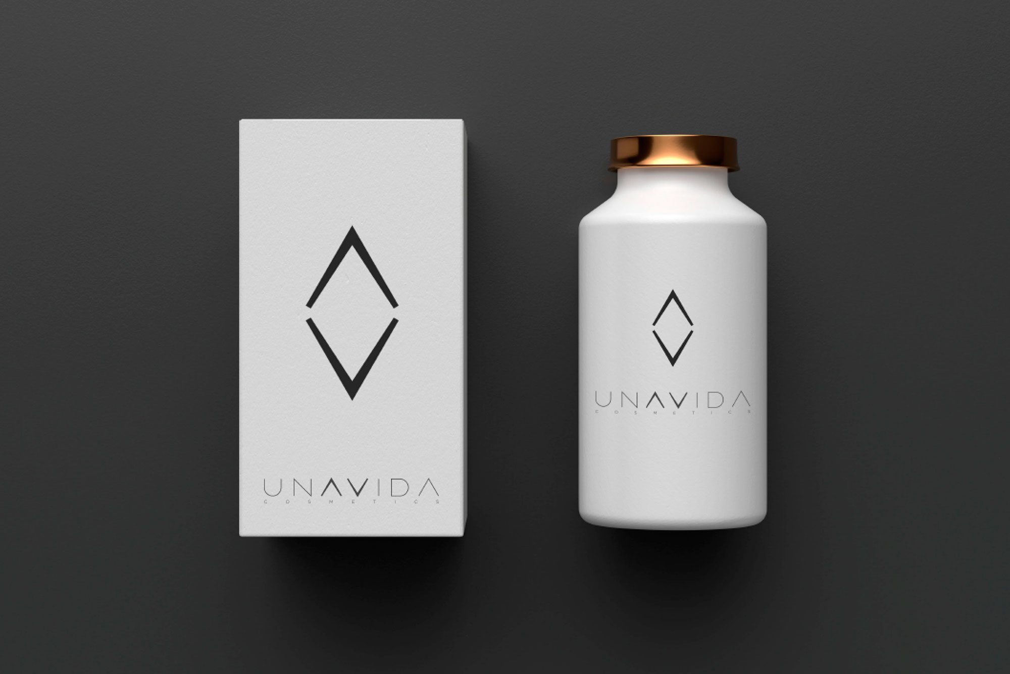
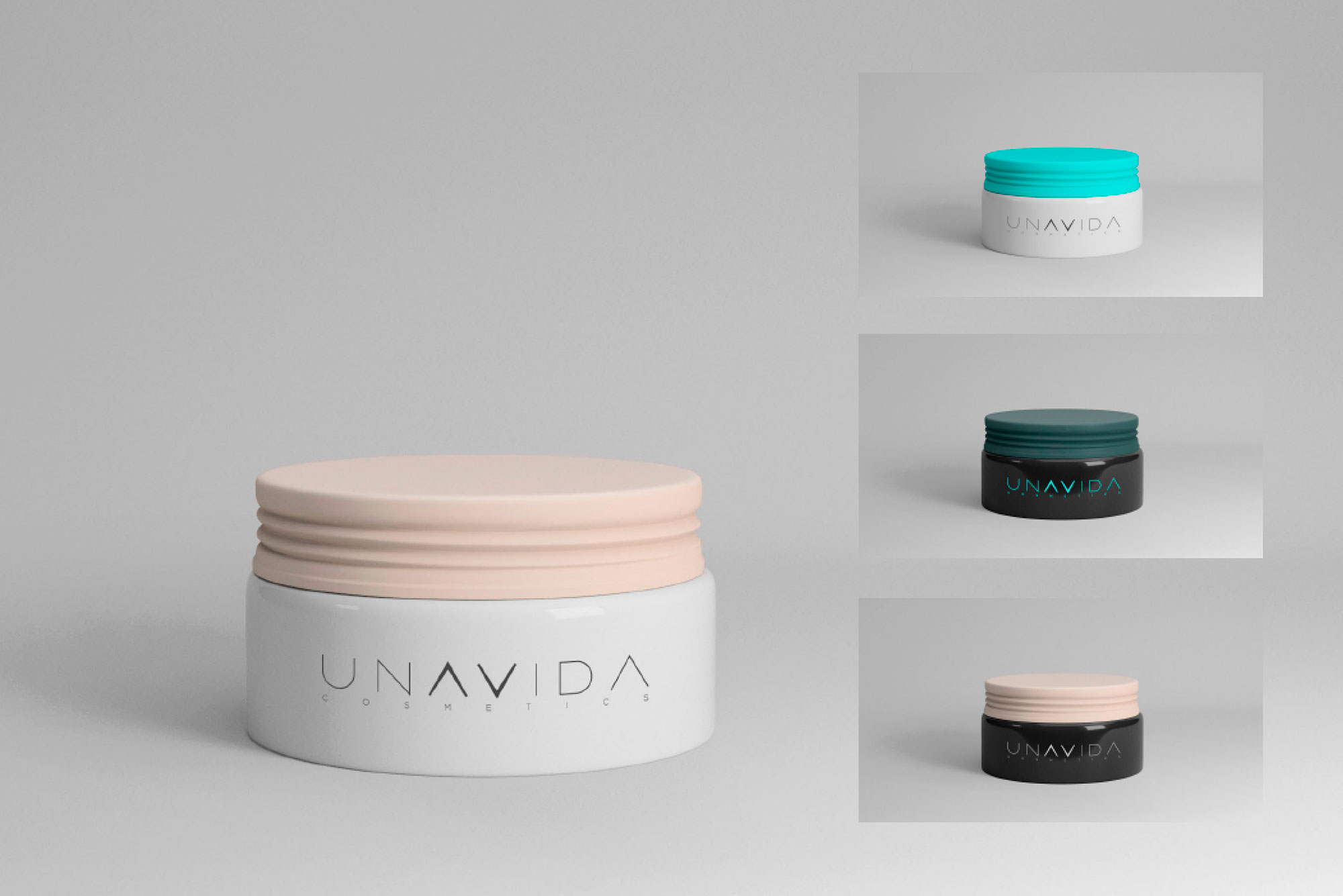
The "S" is surrounded by a circle, being the geometric shape that reflects perfection. The corporate colours selected are cream or make-up and graphite black, two colours that will dress the brand and serve to ensure that all the elements coexist within the same corporate parameters.

We began by carrying out a market analysis to detect those firms with which it would have to share a "shelf" and thus determine the visual style that would allow the brand's values to be differentiated and positioned.

The initial naming did not allow to project the powerful message of a brand based on mindfulness, together with transparency and professionalism, as a differentiating feature.

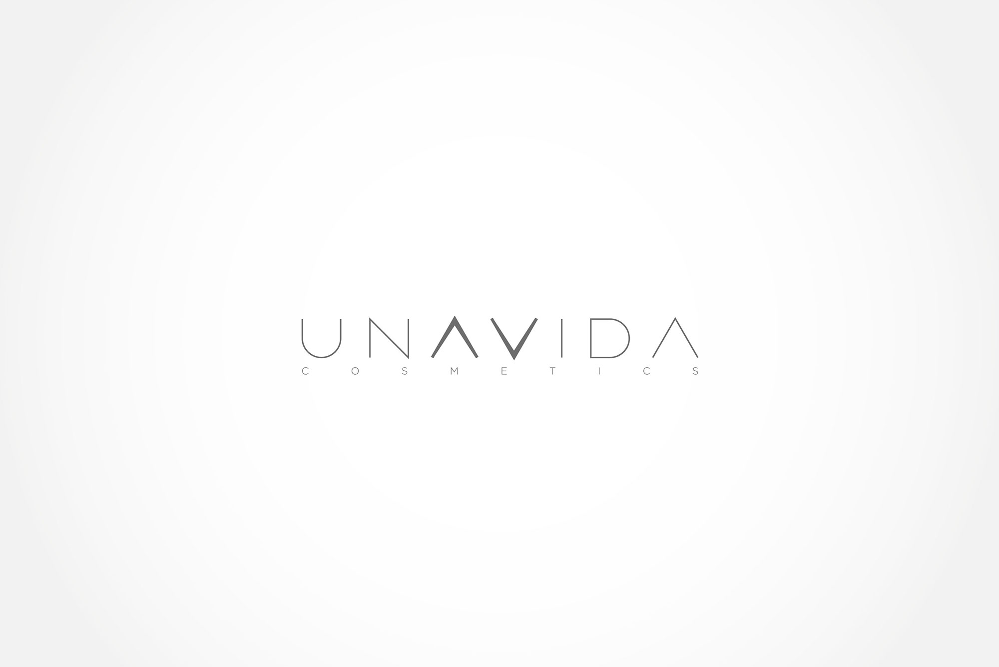
So we looked for a naming that needed no explanation, that would strike a chord of reality and sincerity, and at the same time invite the consumer to reflect. The message is clear and needs no explanation: we only have one life and we must make it worthwhile.

SUBIR