BRANDING

EDE Dental postgraduate courses

A project in which we had to reflect two equally important aspects for the business activity: dentistry and training. It is a first class dental centre where, at the same time, the best postgraduate studies in the country are taught.

Therefore, the objective was clear. We had to visually transmit the professionalism of the centre without forgetting the quality of the training. But, at the same time, we could not lose the focus on dentistry so that the visual identity would transmit the right message at all times to a target audience which, in this case, was twofold: on the one hand, we had the centre's potential patients, and on the other, the potential students of the master's degree.
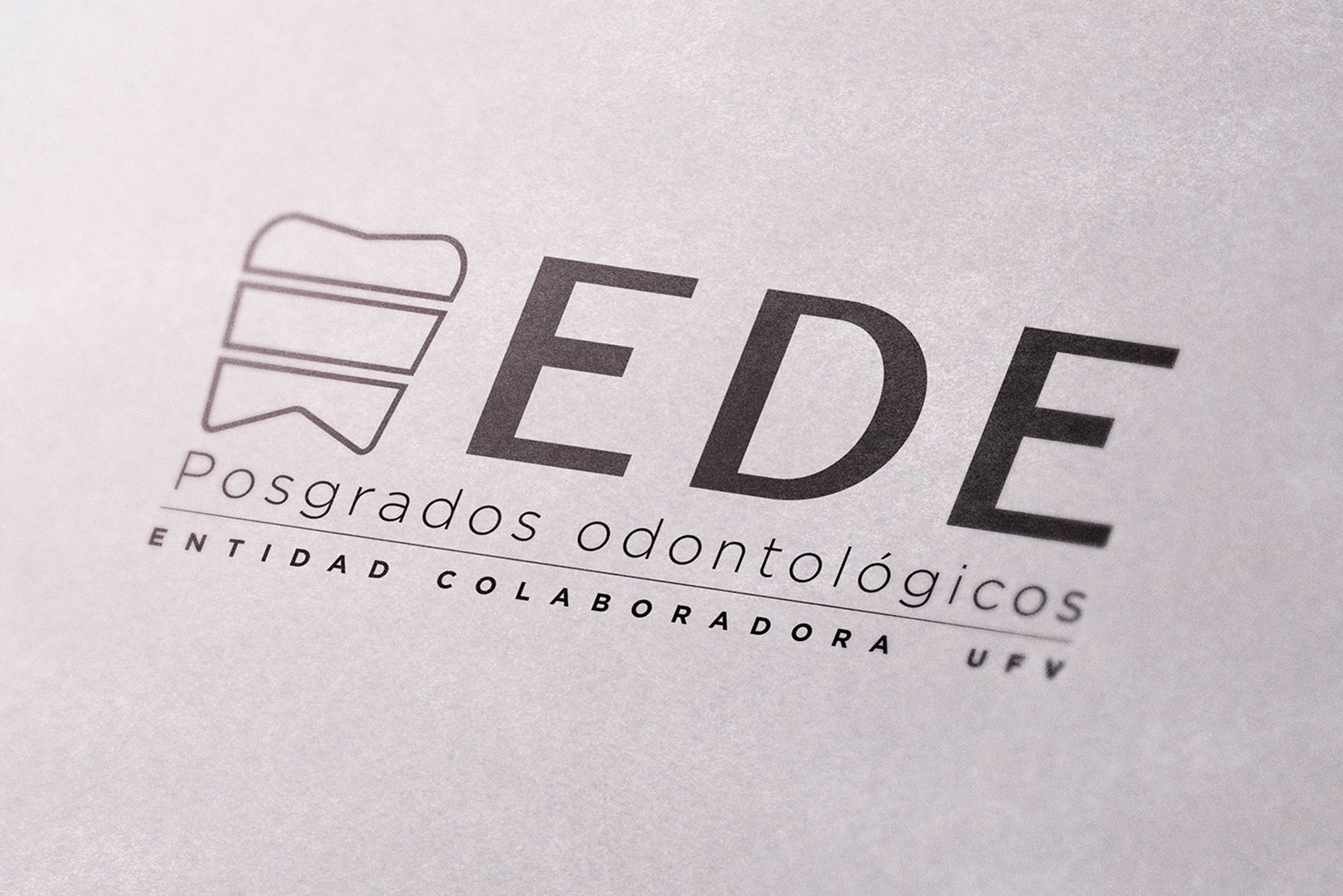
So, using La Muela as a visual concept, we added aesthetic features to move away from over-exploited trends that make it difficult to differentiate the brand and ensure we created a visual identity that would remain fresh and current for a long time to come. Clean and simple lines, with soft curves and no sharp angles. An uncomplicated journey. Just as it should be when it comes to our mouth.

The same was true for the colour palette, sober and professional, which does not try to hide anything and makes clear what the founders conveyed to us in our meetings: that they are serious about what they do.Finally, the typography had to maintain a balance between aesthetics and the brand's objective. So an exclusive and unique typeface was designed with a layout reminiscent of the style of prestigious educational establishments, and we were delighted, because our client's is only the first of many smiles that this brand will create.

SUBIR