BRANDING

Happy, bar-café

A young bar with a friendly atmosphere and good food, which is part of the tapas and conversation concept; a place where you can get together and not have a bad time.

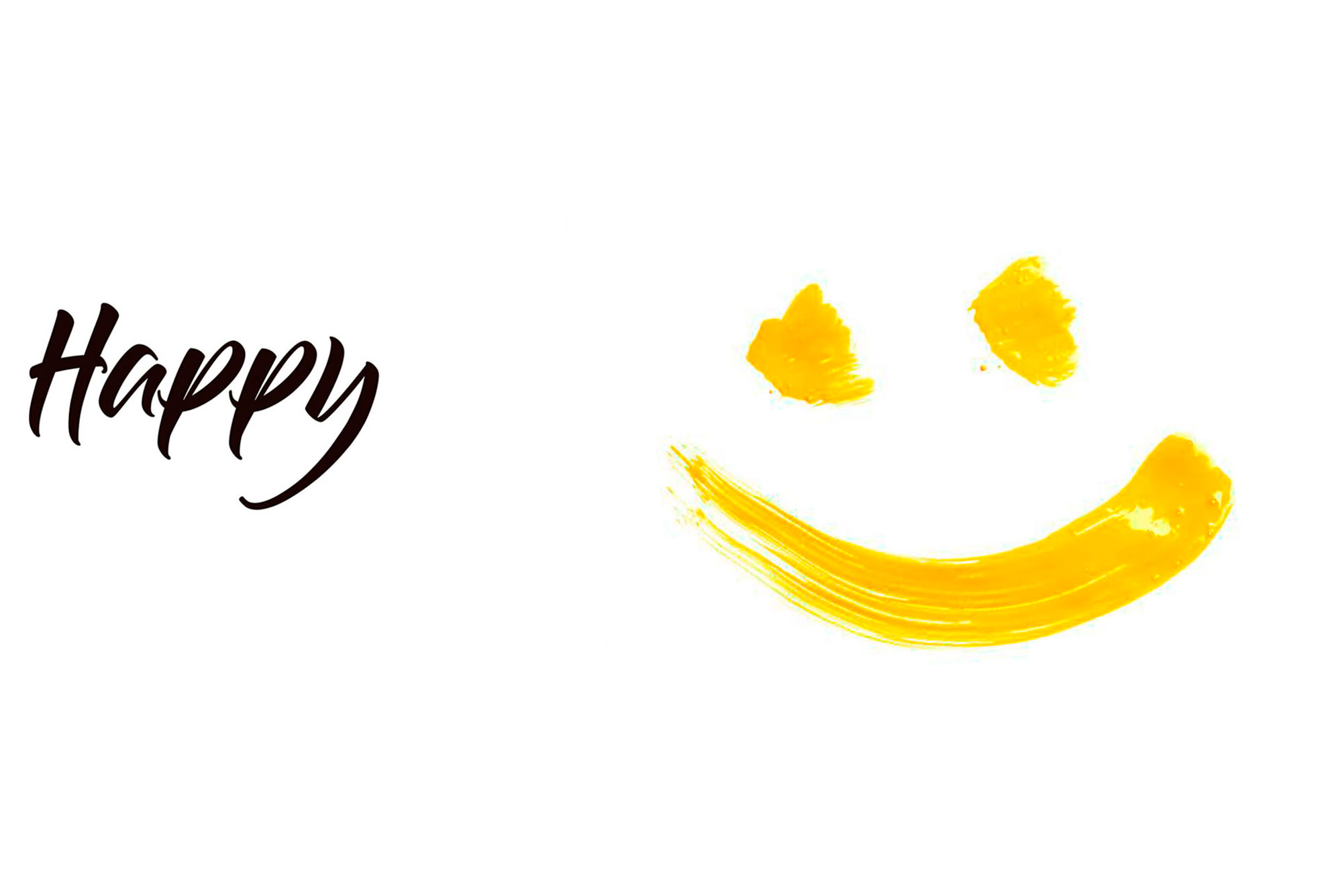
Based on the new and current premises, we have created a cheerful, lively, friendly, eye-catching and striking work with a logo that frames itself to achieve a clear objective: to be a meeting place where the treatment and the feeling is linked to happiness.

Handwritten stroke for the composition of a common and widely used naming, but which does not allow Happy to be conceived in writing in any other way. Through the "Y" at the end of the word, we achieve a wink that brings a creative touch to the brand and a habitual use for a coherent coexistence with everyday life.

.

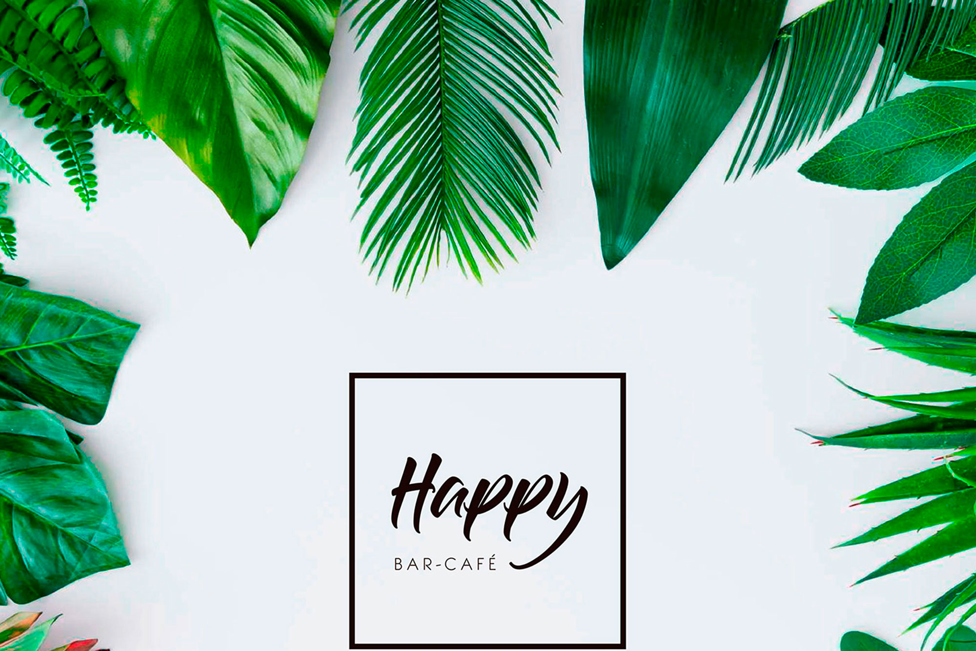
The brand as a whole is framed in a square that gives personality and professionalism to the youthfulness of the development, which can be understood as a brand with experience and experience. Yellow, a symbol of light and life, has been the logical colour chosen to later, from a broader point of view, elaborate a chromatic coexistence in pastel tones that perfectly combine the strokes and drawings based on vegetation.
.

Murals, fun corporate pieces such as the extensive menu that you can taste and a simple but clearly identifiable decoration are the keys to Happy's unquestionable happiness.

SUBIR