BRANDING

Oliveira Drink & Food

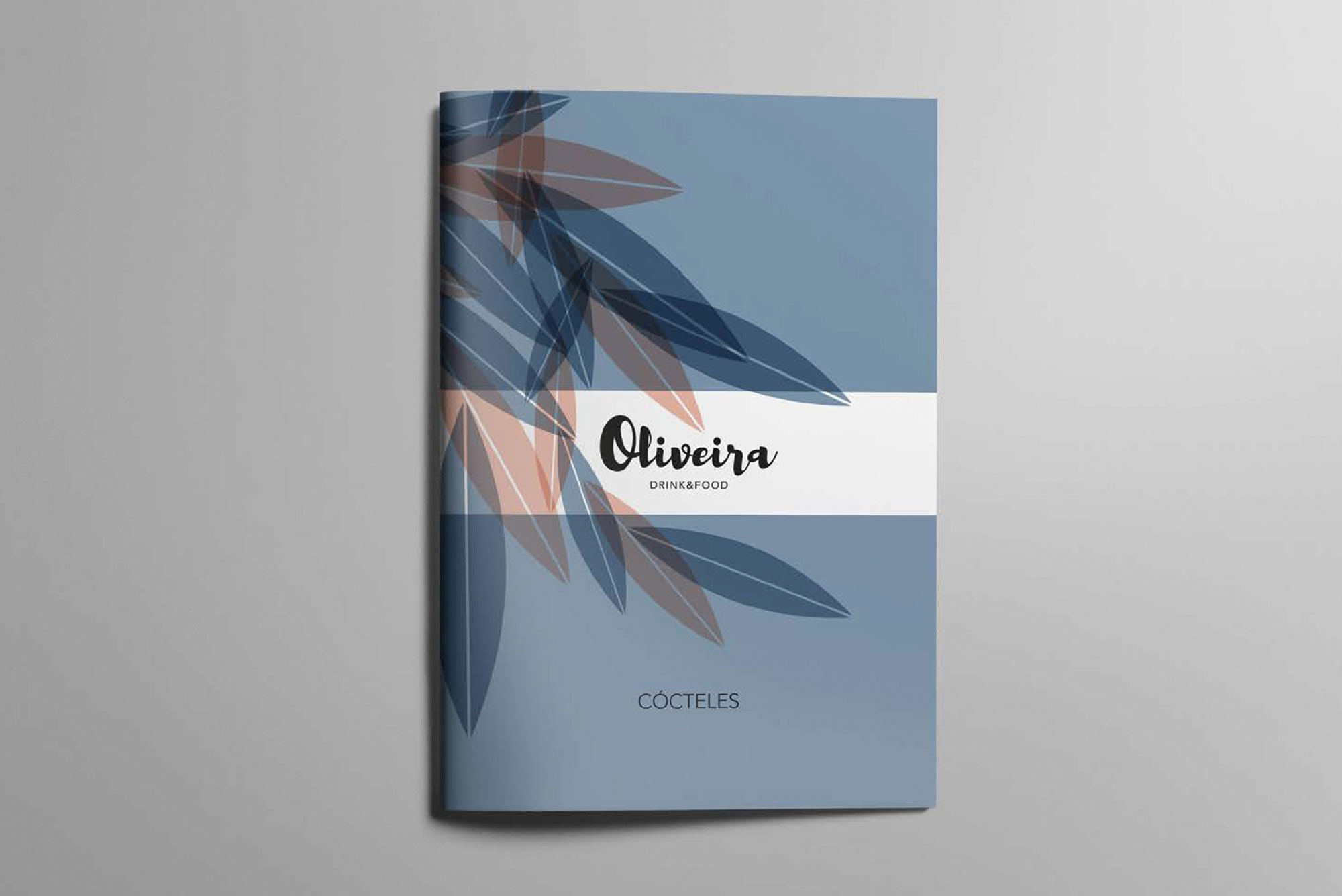
Oliveira is a brand that plays on the concept of duality. Between tradition and modernity, between day and night, between food and drink, between wood and metal... All these steps lead us to meet the protagonist of the premises, which also serves as a reference to give identity to the branding: the olive tree.
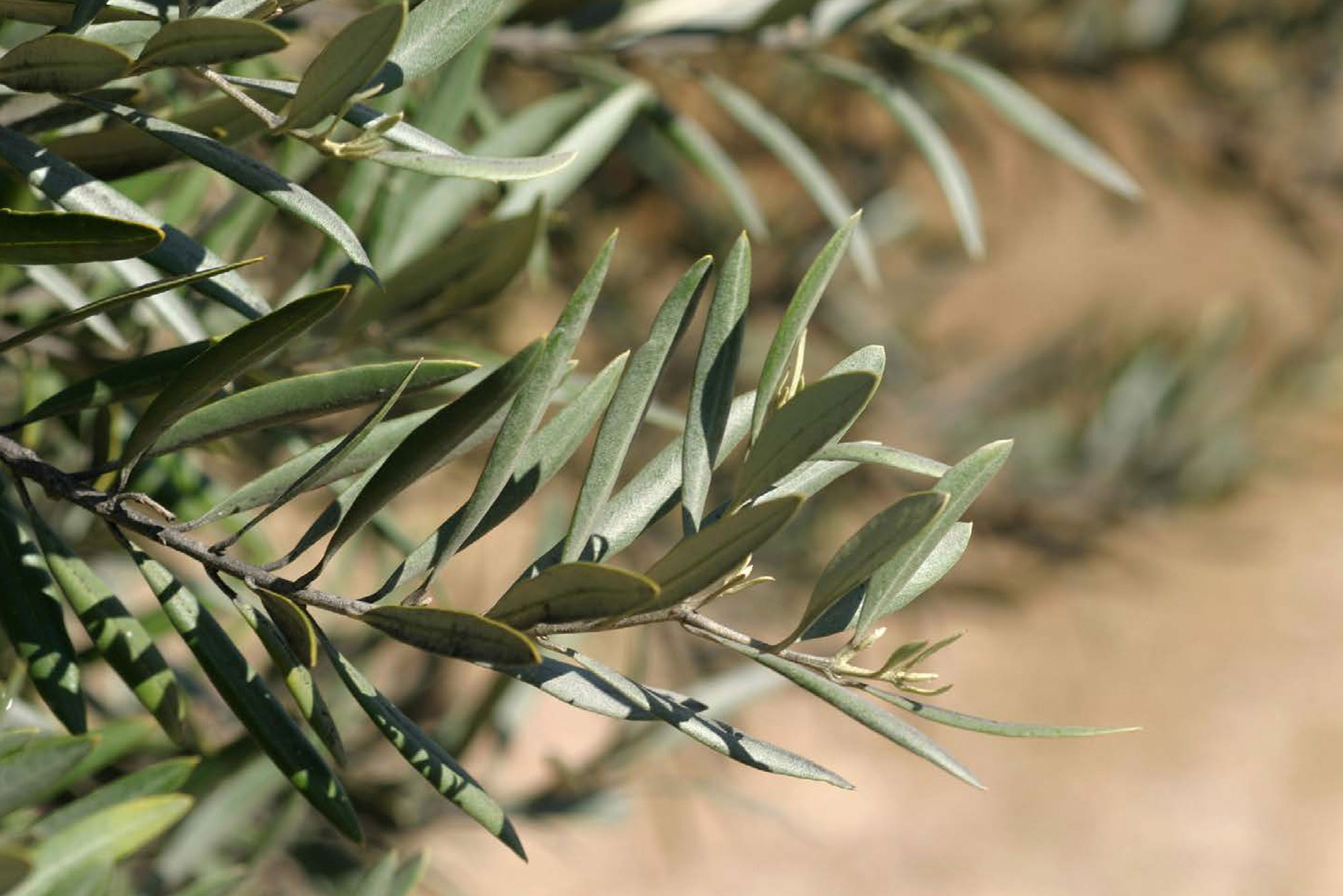
The olive tree, which stands out from the entrance to the magnificent premises, separates the drinking area from the dining area. At the same time, it allows us to continue defining the concept of tradition and Mediterranean atmosphere. But the Brazilian touch of the owner and chef had to be shown in the brand. Thus, we have a personal naming: OLIVEIRA.

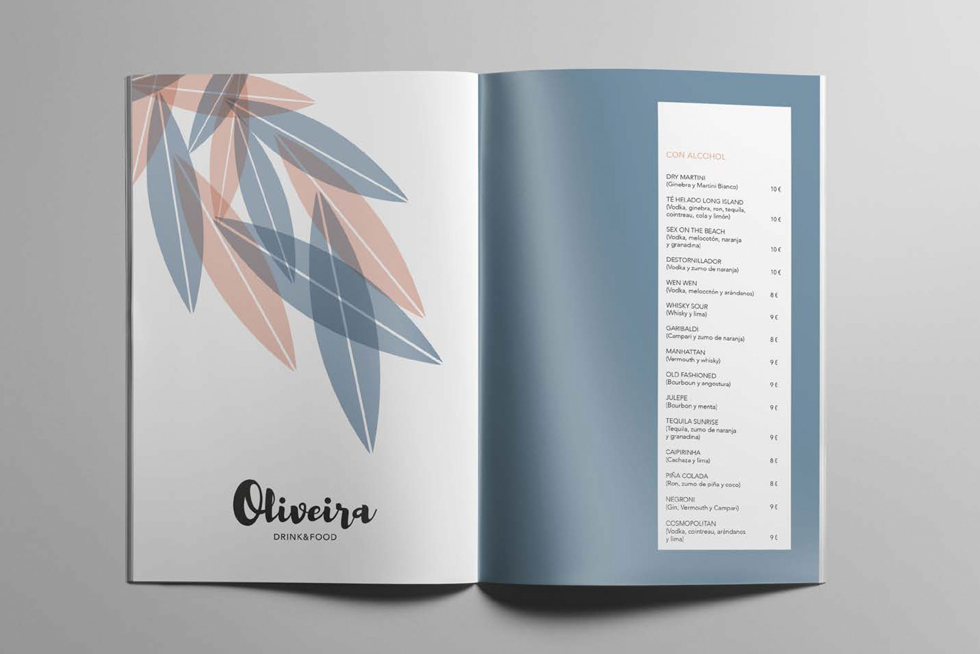
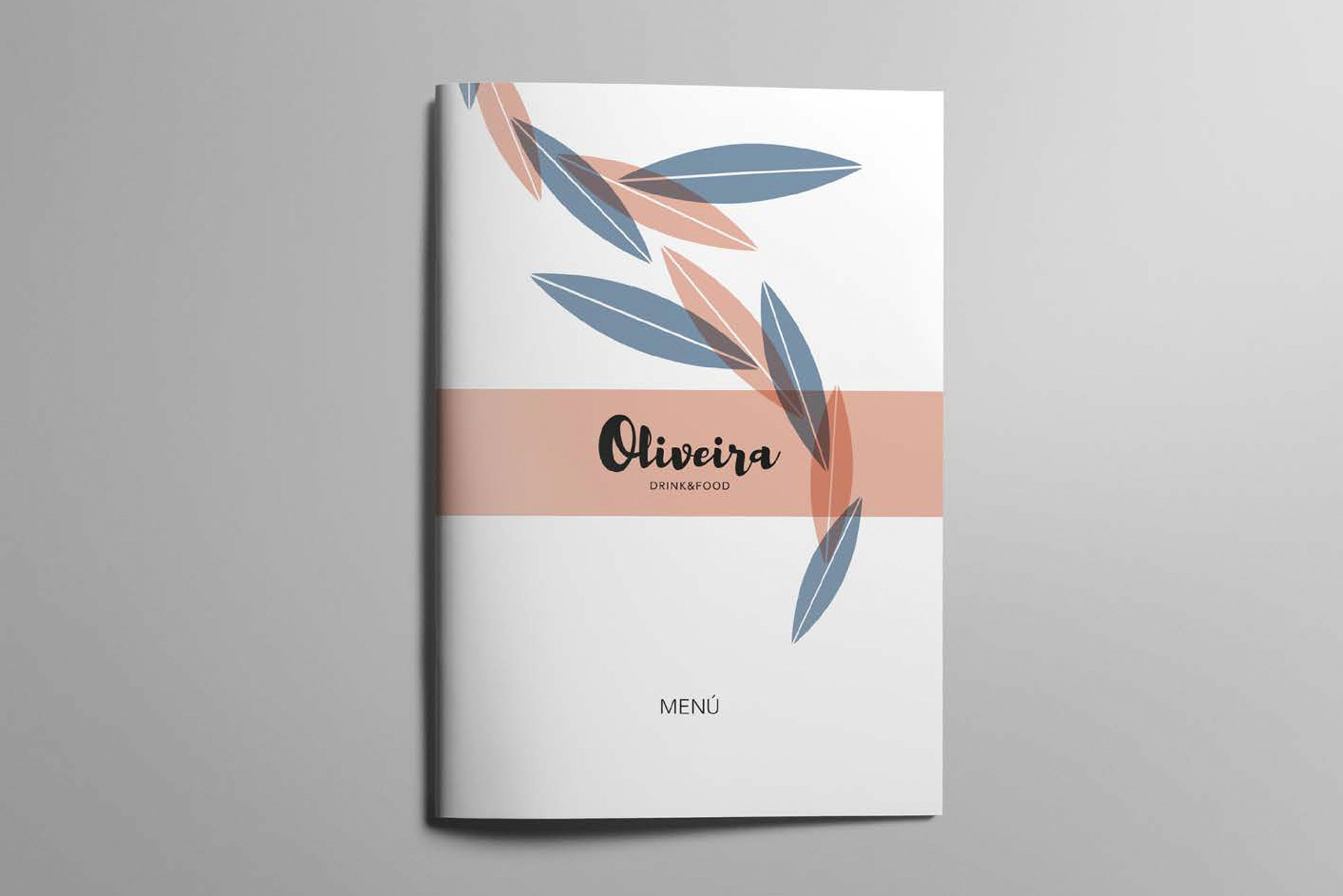
Its brand is built with a lettering that brings simplicity and tradition but at the same time conveys details of modernity. The play of manual graphics together with a sober and elegant secondary typography, allows the duality of the concepts to continue in the role of the duality of the concepts. Just like the colours: pink and blue (day and night).

The branding is supported by a set of textures of olive leaves as a fifth element, to continue giving prominence to the tree that presides over the premises.

SUBIR