BRANDING

Llesca, pá i café

The naming of Llesca is defined by the space and the product. We are talking about an oven/cafeteria with its own bakery, where the protagonist is, and must be, bread. The variety of possibilities it has for different uses make it a good option. The slice is the metonymy (the part of the whole) that allows us to use and taste bread. We use it in different ways: for breakfast (toast), as a dessert (torrija), as a meal (sandwich), as an appetizer (canapé)... The location provides us with a key identifying and aesthetic factor. Slice/torrija = LLESCA.

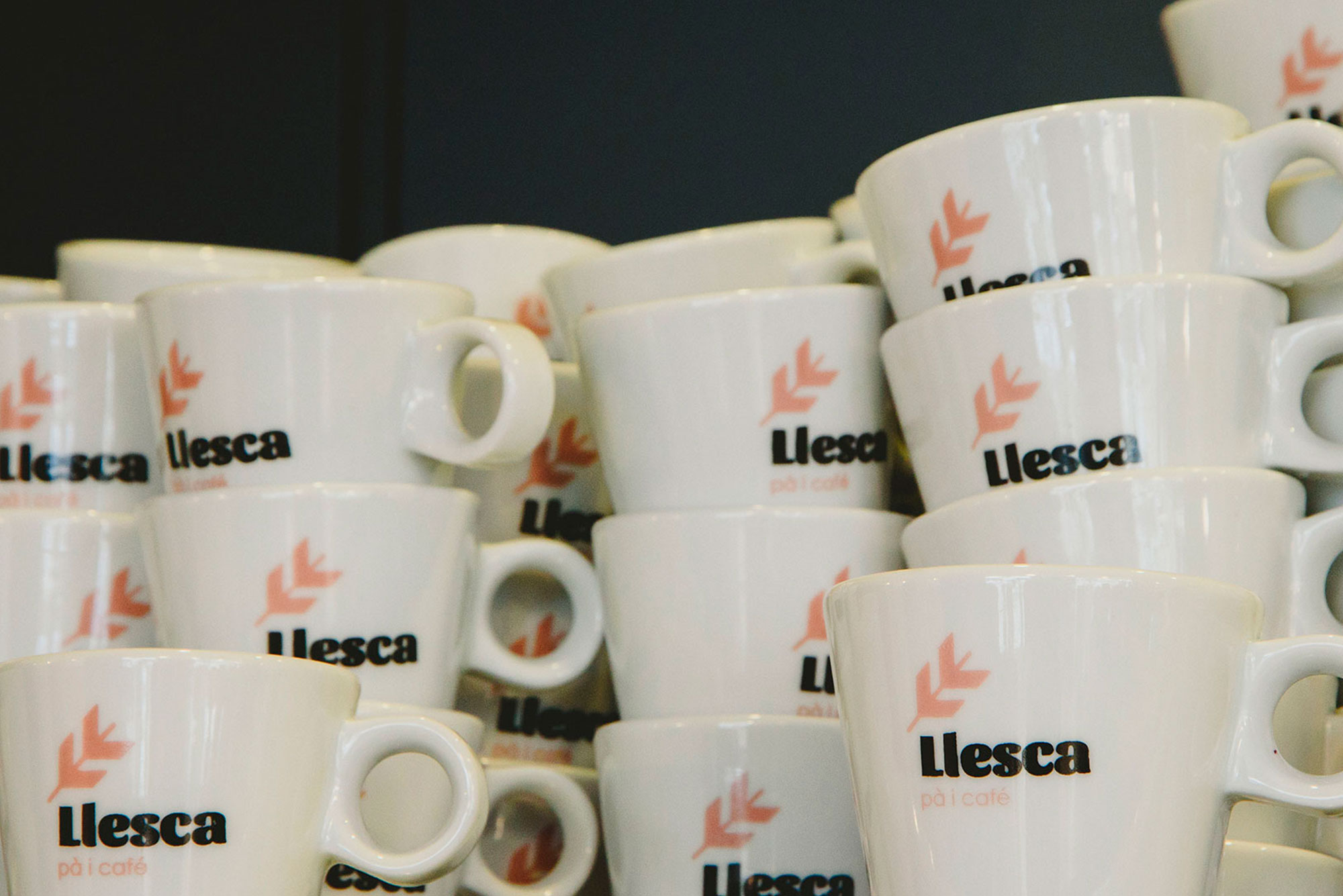
As for the construction of the mark, the "LL", for Llesca, is used, crossing it with a line and giving it a new symbolism close to the ear of wheat. for Llesca, crossing it with a line and giving it a new symbolism similar to the ear of wheat. Here we mix the initial of the name with the base product. The typography used is an extrabold, which gives it great strength and presence, but with soft and sweet finishes that humanise the logotype. Next to it, a softer and more delicate brand claim is used to define the activity.

The play of colours: pink, yellow and blue, blend in with the wood of the premises and give it a very modern and fresh Nordic style.

SUBIR